
We’ve released a new update to NetTrack, focused on improving clarity, usability, and insight into your financial picture. This release introduces two key improvements: a refreshed app icon and a new cash flow trend chart designed to make income and expense patterns easier to understand at a glance.
Updated App Icon
The NetTrack app icon has been refreshed to better represent long-term financial growth and progress. The new design is cleaner, more modern, and fits naturally with current iOS visual styles, especially in dark mode. While subtle, this update improves how the app feels on your home screen and aligns the visual identity more closely with the product’s purpose.
New Income vs. Expenses Trend Chart
The highlight of this release is the new Cash Flow Trend chart. This feature is designed to help you quickly understand how money is moving in and out over time, beyond just tracking balances or net worth totals.
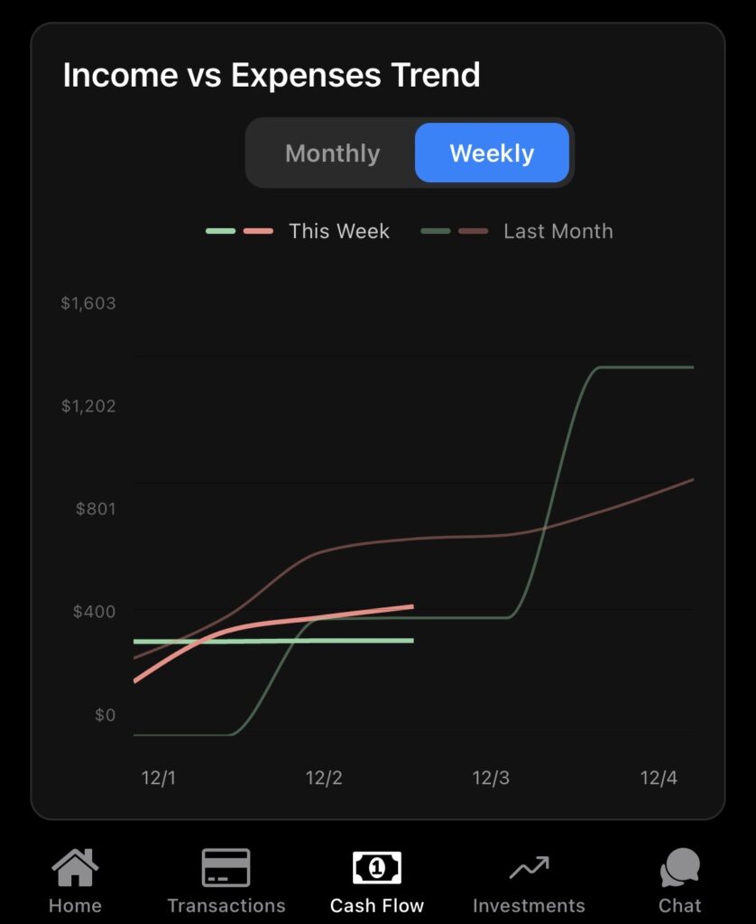
With the new chart, you can:
- Compare income versus expenses over time
- Switch between weekly and monthly views
- See current-period performance alongside a previous period
- Identify trends, spikes, or changes in spending behavior
This makes it easier to spot patterns such as rising expenses, inconsistent income, or improving cash flow without needing to dig through individual transactions.
What’s Coming Next
We’ll continue refining visualizations and expanding insights to make NetTrack an even more powerful tool for understanding your finances. As always, feedback helps shape what we build next, and we appreciate everyone using and supporting the app.
If you haven’t already, update to the latest version to check out the new cash flow trend chart and refreshed look.
Leave a Reply