Blog

  • The Average 401(k) Balance by Age in 2026 (And Why the Median Matters More)

    The Average 401(k) Balance by Age in 2026 (And Why the Median Matters More)

    The average American 401(k) balance is about $141,000 as of early 2026, according to Fidelity. Vanguard's numbers, covering 4.6 million accounts through year-end 2025, put the average at $167,970 — but the median is just $44,115. That gap is the most important fact in this article: the typical saver has far less than the "average" suggests, because a minority of large accounts pull the average up.

    Here's how balances break down by age and generation, and how to judge your own number.

    Average 401(k) balance by generation (Fidelity, Q1 2026)

    Generation Average 401(k) balance
    Baby Boomers $260,300
    Gen X $215,600
    Millennials $82,600
    Gen Z $18,000
    All savers $141,000

    Vanguard's How America Saves 2026 report adds the endpoints by age: workers under 25 average $7,259 (median $2,234), while those 65 and older average $330,186 (median $103,202). At every age, the median runs at roughly a quarter to a third of the average.

    One genuinely encouraging trend: the combined employee-plus-employer savings rate hit a record 14.4% in early 2026 — close to Fidelity's recommended 15%.

    Why the median is your benchmark

    Averages answer "how much money is in 401(k)s per person" — a fact about the system. Medians answer "how much does the typical person have" — a fact about people like you. When the average is $168,000 and the median is $44,000, comparing yourself to the average mostly measures how far you are from a small number of very large accounts.

    Am I on track? The salary-multiple test

    A better benchmark than other people's balances is your own salary. Fidelity's widely used guideline: 1× your salary saved by 30, 3× by 40, 6× by 50, 8× by 60, and 10× by 67 — across all retirement accounts, not just your current 401(k). We break this down with examples in How Much Should You Have Saved by 30, 40, and 50?

    Three things that move the number most

    1. Capture the full employer match. It's an immediate 50–100% return on those dollars; leaving it unclaimed is the most expensive common mistake.
    2. Raise your rate 1% per year. Going from 6% to 12% over six years is barely felt per paycheck but roughly doubles your lifetime contributions.
    3. Count every account. Old 401(k)s from previous jobs, IRAs, and HSAs are all part of the real picture — and orphaned accounts are where fees and forgotten cash-heavy allocations hide.

    That last one is where tracking tools earn their keep: your true retirement position is the sum of scattered accounts, which no single provider's dashboard shows you.

    Frequently asked questions

    What's a good 401(k) balance at 40?
    By Fidelity's guideline, about 3× your salary across retirement accounts — $240,000 for an $80,000 earner. The typical American at that age has meaningfully less, so "on the guideline" means comfortably ahead of the median.

    Why is my balance so far below the average for my age?
    Averages are inflated by high earners and long-tenured savers. Compare to the median, and more importantly, to the salary-multiple targets for your own income.

    Do these figures include IRAs?
    No — they're 401(k)-plan data from Fidelity and Vanguard. Your full retirement picture should add IRAs, HSAs, and old employer plans.

    Where does this data come from?
    Fidelity's quarterly retirement analysis (Q1 2026) and Vanguard's How America Saves 2026 report covering year-end 2025. Both update regularly, and we'll refresh this page as new quarters land.


    See all your retirement accounts — current 401(k), old ones, IRAs — in one place with NetTrack, including how they're actually performing. Start free.

  • Net Worth Percentile by Age: Top 50%, 25%, 10%, and 1% in 2026

    Net Worth Percentile by Age: Top 50%, 25%, 10%, and 1% in 2026

    A household net worth of about $1.9 million puts you in the top 10% of American households. The top 1% starts around $13.7 million, the top 25% at roughly $659,000 — and half of all US households sit below $192,700.

    But overall numbers only tell half the story: a 30-year-old with $400,000 is in a very different position than a 60-year-old with the same amount. Here are the percentile thresholds overall and by age, based on the Federal Reserve's Survey of Consumer Finances.

    US net worth percentiles (all households)

    Percentile Household net worth
    25th (bottom quartile) ~$27,000
    50th (median) ~$192,700
    75th (top 25%) ~$659,000
    90th (top 10%) ~$1.94 million
    95th (top 5%) ~$3.8 million
    99th (top 1%) ~$13.7 million

    Source: Federal Reserve Survey of Consumer Finances (2022, the latest published survey; figures in 2022 dollars).

    Top 10% threshold by age

    Because wealth compounds over a career, the bar for the top 10% rises steeply with age:

    Age group Median net worth Top 10% (90th percentile)
    Under 35 $39,040 ~$390,000
    35–44 $135,300 ~$980,000
    45–54 $246,700 ~$1.76 million
    55–64 $364,270 ~$2.6 million
    65–74 $409,900 ~$3.2 million
    75+ $334,700 ~$2.75 million

    A useful way to read this: a 32-year-old with $400,000 is already in their age group's top 10%, while a 55-year-old with the same amount is only modestly above their cohort's median. Age-adjusted comparison is the honest one.

    What these thresholds actually mean

    • Net worth is household, not individual. A couple's combined assets count as one household, so single-person comparisons should mentally adjust down.
    • The median is the anchor. Half of American households have less than ~$193,000 — if headlines about "average" millionaires make you feel behind, remember the average is distorted by a small number of extremely wealthy households.
    • Percentiles are a snapshot; trajectory is the signal. Moving from the 40th to the 60th percentile over five years matters more than where you happen to stand today.

    For what drives the differences between age groups — compounding, home equity, debt payoff — see our companion piece on the average net worth by age.

    How to find your own percentile

    1. Calculate your net worth — all assets minus all liabilities.
    2. Find your age bracket in the table above and compare against the median first, then the 90th percentile.
    3. Recheck yearly. The interesting question isn't "where am I?" but "which direction am I moving, and how fast?"

    Frequently asked questions

    What net worth is considered rich?
    There's no official line, but the top 10% threshold ($1.9 million per household) is a common benchmark for "wealthy," and the top 1% ($13.7 million) for "rich" in the popular sense.

    Does net worth include home equity?
    Yes — these figures count your home's market value as an asset and the mortgage as a liability. For many households, home equity is the single largest component.

    Where does this data come from?
    The Federal Reserve's Survey of Consumer Finances, conducted every three years. The 2022 survey (published October 2023) is the latest; results from the 2025 survey are expected in late 2026, and we'll update this page when they're released.


    Curious where you actually stand? NetTrack connects your accounts and calculates your real net worth in minutes — then tracks the trend that matters. Start free.

  • How Much Should You Have Saved by 30, 40, and 50? (2026 Benchmarks)

    How Much Should You Have Saved by 30, 40, and 50? (2026 Benchmarks)

    The most widely used benchmark, from Fidelity, is simple: you should have 1× your annual salary saved by age 30, 3× by 40, 6× by 50, 8× by 60, and 10× by 67 — counting all retirement and investment accounts together.

    For someone earning $80,000, that means roughly $80,000 saved by 30, $240,000 by 40, and $480,000 by 50. Here's the full breakdown, why the targets accelerate, and what to do if you're behind.

    Savings targets by age

    Age Target (× salary) At $60k salary At $80k salary At $100k salary
    30 $60,000 $80,000 $100,000
    35 $120,000 $160,000 $200,000
    40 $180,000 $240,000 $300,000
    45 $240,000 $320,000 $400,000
    50 $360,000 $480,000 $600,000
    55 $420,000 $560,000 $700,000
    60 $480,000 $640,000 $800,000
    67 10× $600,000 $800,000 $1,000,000

    Based on Fidelity's retirement savings guidelines, which assume retiring at 67 and maintaining your pre-retirement lifestyle.

    Two clarifications people often miss:

    • "Saved" means invested, not in a savings account. These targets assume market growth doing much of the work — 401(k)s, IRAs, HSAs, and brokerage accounts all count.
    • The multiple is of your current salary. Get a big raise and your target jumps too; that's the guideline working as intended, since your lifestyle (and the retirement that must fund it) got more expensive.

    Why the targets accelerate

    Notice the jump: one salary in your first decade of work, then two more by 40, then three more by 50. That's compounding math, not expectation inflation — money invested at 25 has 40 years to grow, so early savings do disproportionate work. The corollary cuts both ways: being behind at 30 is cheap to fix; being behind at 50 is not.

    Behind the curve? In good company — and here's the playbook

    Most Americans are behind these benchmarks — the median 401(k) balance is about $44,000, far below where the multiples say a mid-career saver should be. If that's you:

    1. Get the full employer match first. It's the highest-return money available to you.
    2. Use catch-up contributions if you're 50+. The IRS allows meaningfully higher 401(k) and IRA limits from age 50.
    3. Automate an annual 1% increase. Most plans can do this automatically; you won't feel it, and it compounds your savings rate.
    4. Attack high-interest debt in parallel. A credit card at 24% outruns any market return; clearing it is a guaranteed win.
    5. Know your real number. Scattered accounts make people underestimate (or overestimate) where they stand — the benchmark only helps if you're comparing it against your true total.

    How this fits with other benchmarks

    Salary multiples measure retirement readiness. For the broader picture — home equity, debts, everything — the yardstick is net worth; see the average net worth by age and what puts you in the top 10%. The two views together answer both "can I retire?" and "am I building wealth?"

    Frequently asked questions

    Are Fidelity's multiples too aggressive?
    They're calibrated for maintaining your lifestyle from 67 onward. If you expect lower expenses, Social Security covering a bigger share, or working past 67, you can land safely below 10×. Planning to retire early? You'll need more, sooner.

    Should I count my home equity?
    Not for these targets — you can't spend the house you live in. Home equity belongs in your net worth, not your retirement-savings multiple.

    What if my income just increased a lot?
    Your multiple drops overnight, and that's fine. Treat the new target as a direction, not a pass/fail grade — and avoid letting lifestyle inflate to the new income while you close the gap.


    The hardest part is knowing your true total across every account. NetTrack adds it up automatically and shows whether the number is moving fast enough. Start free.

  • Best Empower (Personal Capital) Alternatives in 2026

    Best Empower (Personal Capital) Alternatives in 2026

    Empower's Personal Dashboard (the app formerly known as Personal Capital) is still one of the best free net worth trackers available. So why are so many people looking for a replacement?

    Three reasons come up again and again: the advisory sales calls that start once your linked balances cross a threshold, account sync issues that leave connections broken for days, and a dashboard that has barely evolved since the Personal Capital days. Empower is a wealth-management firm first — the free dashboard exists to find advisory clients, and it shows.

    If any of that sounds familiar, here are the best Empower alternatives in 2026, and who each one is right for.

    The best Empower alternatives at a glance

    App Best for Price Investment return Sales calls
    NetTrack Net worth + true investment performance Free tier; paid for unlimited accounts Flow-adjusted Never
    Monarch Money All-in-one budgeting + net worth ~$100/year Good Never
    Kubera Complex, multi-asset portfolios ~$199/year Basic Never
    Copilot Money Design-first Apple users ~$95/year Good Never
    Empower (keep it) Free tracking, don't mind outreach Free Good Yes

    1. NetTrack — best overall replacement

    NetTrack is the closest match for what most people actually use Empower for: connecting every account, watching net worth over time, and understanding how their investments are really doing.

    It goes further than Empower on the investment side. NetTrack computes a flow-adjusted return for every account, so deposits and withdrawals don't get counted as gains or losses — a common flaw in dashboards that just chart your balance. You also get net worth attribution (a breakdown of exactly what changed your net worth each month), dividend tracking, real estate tracking, goals with projections, and synced web and mobile apps.

    And because NetTrack makes money from subscriptions — not from managing your assets — there is no advisory upsell and nobody will ever call you.

    • Best for: anyone who used Empower primarily for net worth and investment tracking
    • Pricing: free tier (limited connections); paid plan for unlimited accounts
    • Platforms: web, iOS, Android

    2. Monarch Money — best all-in-one

    If you want budgeting, goals, and net worth in a single polished app, Monarch is the strongest all-rounder, with great support for couples. The trade-off is price — there's no free tier — and its investment analytics are lighter than Empower's.

    • Best for: households that want budgeting and net worth together
    • Pricing: ~$100/year
    • Platforms: web, iOS, Android

    3. Kubera — best for complex portfolios

    Crypto, foreign bank accounts, private equity, collectibles, real estate across countries — Kubera tracks nearly anything with a value. It's the pick for high-net-worth users with assets a mainstream aggregator can't handle, at a premium price.

    • Best for: complex, multi-currency, alternative-asset portfolios
    • Pricing: ~$199/year
    • Platforms: web-first

    4. Copilot Money — best design

    Copilot is the best-looking personal finance app on Apple platforms, with excellent transaction categorization. Net worth and investment tracking are solid but secondary to its spending focus, and there's no Android or full web experience yet.

    • Best for: iPhone/Mac users who care about design and spending insights
    • Pricing: ~$95/year
    • Platforms: iOS, macOS

    When you should just stay with Empower

    Empower still makes sense if you want a completely free tool, you like its retirement planner and fee analyzer, and you genuinely don't mind declining the occasional advisory call. It's a good product — the frustrations are with the business model around it, not the dashboard itself.

    How to switch

    1. Export or screenshot your history. Empower doesn't offer a clean full export, so capture your current net worth and balances before you leave.
    2. Connect accounts in the new app. Aggregation coverage differs — connect your two or three most important institutions first and confirm they sync.
    3. Add manual assets. Recreate your home value, vehicles, and any private holdings.
    4. Run both for a month. Once the new app's numbers match reality, close out the old one.

    Frequently asked questions

    Is Empower Personal Dashboard still free in 2026?
    Yes. The dashboard is free; Empower monetizes it by offering wealth-management services to users with larger balances, which is where the sales outreach comes from.

    What's the best free Empower alternative?
    NetTrack's free tier covers basic net worth tracking with a limited number of connections. If you need many connected accounts for free, Empower itself is still hard to beat — the alternatives charge because subscriptions are their only revenue.

    Which Empower alternative has the best investment tracking?
    NetTrack, for one specific reason: flow-adjusted returns. Most apps show a balance chart that mixes your contributions with market performance. NetTrack separates them, so you can see how your portfolio actually performed.

    Will I get sales calls from these alternatives?
    No. NetTrack, Monarch, Kubera, and Copilot are all subscription businesses. None of them manage assets or sell advisory services.


    Ready to leave the sales calls behind? Try NetTrack free — connect your accounts and see your true net worth and investment returns in minutes.

  • Best Monarch Money Alternatives in 2026

    Best Monarch Money Alternatives in 2026

    Monarch Money became the default Mint replacement for a reason: it does budgeting, goals, and net worth in one polished app. But after its price increase, plenty of users are asking whether ~$100 a year is worth it — especially if they only use a fraction of the feature set.

    That's the key to choosing an alternative: figure out which part of Monarch you actually use. Most people fall into one of three camps — net worth and investments, hands-on budgeting, or bill management. Here's the best option for each in 2026.

    The best Monarch alternatives at a glance

    App Best for Price Free tier
    NetTrack Net worth + investment performance Paid for unlimited accounts Yes
    Empower Free net worth tracking Free Yes
    YNAB Zero-based budgeting ~$109/year No
    Copilot Money Design-first Apple users ~$95/year No
    Rocket Money Bills + subscription management ~$6–12/month Limited

    1. NetTrack — best for net worth and investments

    If you open Monarch mostly to look at your net worth graph and your accounts, NetTrack does that job better — because it's the entire focus of the app.

    NetTrack connects your bank, brokerage, retirement, and credit accounts, tracks net worth with full history, and explains why it changed with month-over-month attribution. On investments it's a clear step up from Monarch: flow-adjusted returns separate market performance from your own deposits, so a month where you contributed $2,000 doesn't masquerade as a 4% gain. Dividend tracking, portfolio analytics, real estate values, goals with projections, and envelope-style budgeting round it out, on web, iOS, and Android.

    • Best for: the big-picture camp — net worth, investments, long-term progress
    • Pricing: free tier (limited connections); paid plan for unlimited accounts

    2. Empower Personal Dashboard — best free option

    Empower (formerly Personal Capital) remains the strongest free net worth and investment dashboard, including a good retirement planner and fee analyzer. The catch is well-known: it's run by a wealth manager, so larger balances attract advisory sales calls, and budgeting is weak.

    • Best for: free net worth tracking, if you can tolerate the outreach
    • Pricing: free

    3. YNAB — best for serious budgeters

    If Monarch's budgets never actually changed your spending, YNAB's zero-based "give every dollar a job" method probably will. It's a philosophy with software attached — more work, more results. Net worth tracking is an afterthought.

    • Best for: people who want to actively control spending
    • Pricing: ~$109/year

    4. Copilot Money — best design on Apple platforms

    Copilot has the best-designed interface in personal finance, with standout automatic categorization. It covers spending, budgets, and investments well — but it's Apple-only, so mixed-platform households should look elsewhere.

    • Best for: iPhone/Mac users focused on spending insights
    • Pricing: ~$95/year

    5. Rocket Money — best for bills and subscriptions

    Rocket Money's strength is finding and cancelling subscriptions and negotiating bills. As a full finance dashboard it's shallow, but as a money-saving utility it pays for itself quickly.

    • Best for: cutting recurring costs
    • Pricing: free tier; premium ~$6–12/month (choose your price)

    How to choose

    • You mostly watch net worth and investments → NetTrack
    • You want free above all → Empower
    • You need to fix your spending → YNAB
    • You're all-in on Apple and love good design → Copilot
    • Your problem is subscriptions and bills → Rocket Money
    • You genuinely use all of Monarch → stay. It's still the best all-in-one.

    Frequently asked questions

    Is there a cheaper app that does everything Monarch does?
    Not really — all-in-one apps with reliable bank syncing cost money to run, so true Monarch clones price similarly. The savings come from picking a focused app that does the part you use.

    What's the best Monarch alternative for couples?
    NetTrack supports households, so partners can track combined net worth together without sharing logins. Monarch is also genuinely strong here — it's one of its best features.

    Can I switch without losing my history?
    Your transaction history generally doesn't transfer between apps, but your balances and holdings sync fresh from your institutions. Most aggregators also backfill some transaction history on first connect.


    Tracking net worth is the part that matters most. Start free with NetTrack and see your whole financial picture in one place.

  • Why Your Portfolio ‘Return’ Is Lying to You (Flow-Adjusted Returns, Explained)

    Why Your Portfolio ‘Return’ Is Lying to You (Flow-Adjusted Returns, Explained)

    Your brokerage balance was $50,000 last month. Today it's $53,000. Great month, right? +6%?

    Not if $2,500 of that was your own paycheck being deposited. Your investments actually earned $500 — about 1% — and the rest was just you moving your own money around. This is the single most common way people misread their portfolio performance, and most finance apps make it worse by charting raw balances.

    Here's how returns actually work, and how to see your real number.

    The problem: deposits look like gains

    A balance chart answers "how much money is in the account?" It cannot answer "how well are my investments performing?" — because every deposit pushes the line up and every withdrawal pushes it down, regardless of what the market did.

    The distortion is biggest for exactly the people trying hardest: if you're contributing $500 every two weeks to a 401(k), your balance chart will look fantastic even in a flat market. Conversely, retirees drawing down an account can have great investment performance that looks like steady decline.

    A return is only meaningful if it's adjusted for cash flows — deposits and withdrawals stripped out, so what's left is actual performance.

    The fix: flow-adjusted returns

    The idea is simple:

    Investment gain = (ending balance − starting balance) − net deposits

    In the example above: ($53,000 − $50,000) − $2,500 = $500 of real gain, on roughly $50,000 of invested money ≈ 1%, not 6%.

    Finance professionals formalize this in two ways:

    Money-weighted return (MWR)

    The return your money actually experienced, accounting for when each deposit and withdrawal happened. A deposit made right before a rally boosts your MWR; one made right before a dip drags it down. This is the honest answer to "how did I do?"

    Time-weighted return (TWR)

    The return of the strategy, with the effect of cash-flow timing removed entirely. Fund managers report TWR because they don't control when clients add or remove money. It answers "how did the investments do?" — useful for comparing against the S&P 500, less personal.

    For individual investors tracking their own progress, money-weighted (flow-adjusted) return is the number that matters: it reflects your actual dollars, your actual timing, your actual outcome.

    A worked example

    Say you start January with $10,000, deposit $1,000 on the 15th, and end the month at $11,300.

    • Naive read: $10,000 → $11,300 = "+13%". Wrong.
    • Flow-adjusted: gain = ($11,300 − $10,000) − $1,000 = $300. Your money earned roughly 3% — a good month, but a very different number than 13%.

    Compound that mistake over years of steady contributions and you can convince yourself you're a great investor while underperforming a savings account.

    Why most apps get this wrong

    Computing flow-adjusted returns requires transaction-level data — every deposit, withdrawal, dividend, and transfer, per account — not just daily balances. Many net worth apps only pull balances, so a balance chart is all they can show. Others mix methods across screens, so the "return" on one page doesn't match another.

    NetTrack computes a flow-adjusted return for every investment account, and your portfolio return is built from those same per-account numbers — one method, one basis, everywhere in the app. Deposits, withdrawals, and transfers between your own accounts never masquerade as performance. Dividends are tracked and counted as the returns they are.

    How to check your own numbers

    1. Pick one account and one month.
    2. Write down the starting balance, ending balance, and every deposit/withdrawal in between.
    3. Compute: (end − start) − net deposits = true gain.
    4. Compare that to what your app is showing you.

    If your app's "return" moves every time you contribute, it's showing you a balance chart with a percent sign on it.

    Frequently asked questions

    What is a flow-adjusted return?
    A return calculated after removing the effect of deposits and withdrawals, so it reflects only investment performance. Money-weighted return is the standard formalization.

    Should I use time-weighted or money-weighted return?
    Money-weighted for tracking your own progress (it's what your dollars actually earned). Time-weighted for judging a strategy or comparing a manager to a benchmark.

    Do dividends count as gains?
    Yes — dividends are investment income and belong in your return. But a transfer of your own cash into the account does not. Good tracking distinguishes the two.

    Why does my 401(k) provider show a different return than my balance growth?
    Because your provider (correctly) adjusts for your contributions. The balance grew from both contributions and returns; the reported return strips contributions out.


    Want to see how your portfolio is actually performing? NetTrack computes flow-adjusted returns for every account, automatically. Try it free.

  • Your Finances, Right on Your Home Screen

    Your Finances, Right on Your Home Screen

    One of the biggest goals for NetTrack has always been making it easier to stay aware of your finances without requiring you to open the app every day.

    With NetTrack 1.6, we’re introducing iOS Home Screen Widgets—giving you a live view of the metrics that matter most every time you unlock your phone.


    Your Financial Dashboard at a Glance

    Instead of opening the app just to check your progress, your financial snapshot is now always visible.

    Choose from four different widgets:

    Net Worth

    Watch your net worth grow over time with a beautiful chart showing your selected time period.

    See:

    • Current net worth
    • Dollar and percentage change
    • Trend visualization
    • Automatic updates throughout the day

    Perfect for staying motivated as you build wealth.


    Cash Flow

    Know exactly how your month is shaping up without opening the app.

    The Cash Flow widget shows:

    • Net cash flow
    • Income vs. expenses
    • Comparison to the previous period
    • A running chart throughout the month

    It’s one of the easiest ways to keep spending in check before the month is over.


    Savings Goals

    Keep your biggest financial goals front and center.

    Whether you’re saving for:

    • An emergency fund
    • A house down payment
    • A vacation
    • A new car

    …the Goal widget shows your progress with a clean circular indicator so you’re reminded of what you’re working toward every time you unlock your phone.


    Savings Rate

    Your savings rate is one of the strongest indicators of long-term financial health.

    The Savings Rate widget displays:

    • Your current savings rate
    • Progress toward your target
    • Historical performance

    Small improvements compound into massive results over time, and having this metric visible every day makes it easier to stay consistent.


    Customize Every Widget

    Everyone tracks money differently.

    Each widget lets you choose the time range that works best for you, whether you’re focused on this month, the last few months, or longer-term trends. Your preferences are remembered independently for each widget, so you can build the financial dashboard that’s most useful to you.


    Privacy First

    Financial information is personal.

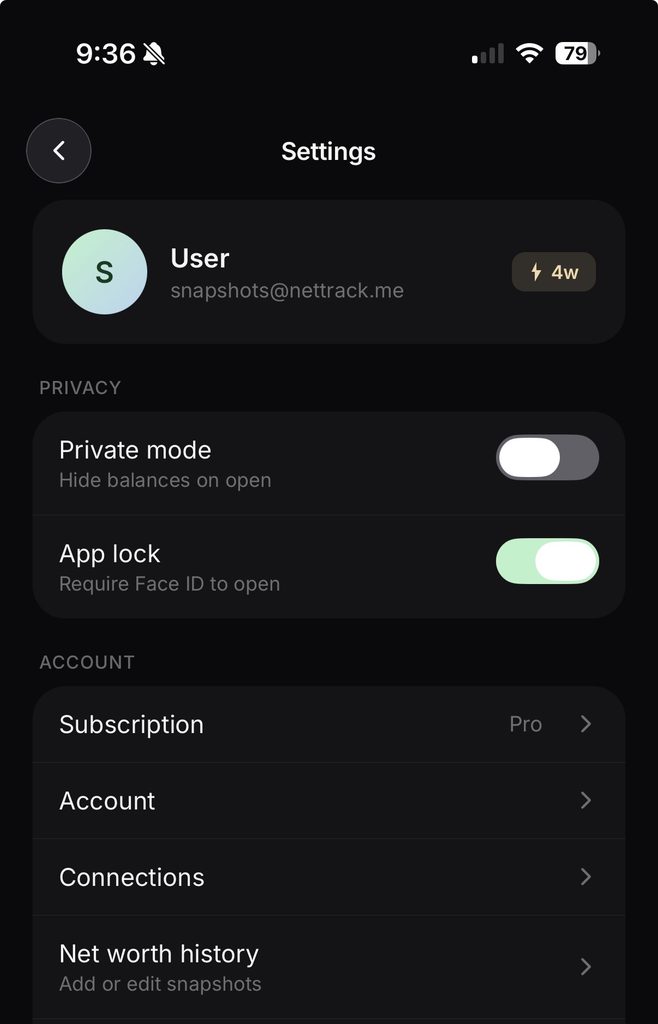
    If you use NetTrack’s Private Mode, your Home Screen widgets automatically respect that setting, masking balances while still showing your progress and trends. That means you can keep widgets on your Home Screen without worrying about exposing sensitive information when someone else picks up your phone.


    How to Add NetTrack Widgets

    Adding a widget only takes a few seconds:

    1. Long-press anywhere on your Home Screen.
    2. Tap the + button.
    3. Search for NetTrack.
    4. Choose your preferred widget size.
    5. Place it wherever you’d like.

    Now your finances are only a glance away.


    Available Now

    NetTrack 1.6 is available today on iOS.

    We can’t wait to see how you customize your Home Screen, and we’re already working on even more ways to bring your finances closer to you.

    As always, thank you for supporting NetTrack and helping shape the app with your feedback. More exciting updates are coming soon.

  • Introducing Net Worth Attribution: Finally Understand What Changed

    Introducing Net Worth Attribution: Finally Understand What Changed

    Your net worth going up is great.

    But there has always been a bigger question:

    Why?

    Did your investments grow?
    Did you actually save more money?
    Did debt increase?
    Was it just the market moving?

    Today, we’re introducing Net Worth Attribution — a new way to understand exactly what is driving changes in your financial picture.

    Go Beyond the Number

    Traditional net worth trackers show a simple chart:

    $100,000 → $110,000

    That tells you what happened, but not what caused it.

    NetTrack now breaks every change down into the key drivers behind your progress:

    • Investments — see how much came from market gains vs new contributions
    • Cash Savings — understand income, spending, and actual money saved
    • Borrowing — track how changes in debt affected your growth
    • Other Assets — see the impact from everything else you own

    Instead of just seeing your net worth increased by $8,000, you’ll know exactly where that $8,000 came from.

    Separate Your Effort From The Market

    One of the hardest parts of tracking wealth is understanding what you actually controlled.

    A great month in the stock market can hide overspending.

    A down market can make a strong savings month feel like failure.

    Net Worth Attribution separates those signals.

    You can now see whether your progress came from:

    • your investments growing
    • consistent saving
    • paying down debt
    • adding money toward your goals

    Track What Actually Builds Wealth

    Building wealth is about the small actions repeated over time.

    Saving more than you spend.
    Investing consistently.
    Reducing unnecessary debt.

    NetTrack now helps you see those actions clearly — not just the final result.

    Available Now

    Net Worth Attribution is available today in the latest version of NetTrack.

    Update the app and open What Changed from your net worth dashboard to see what’s really moving your money.

    Because knowing your number is helpful.

    Knowing why it changed is how you improve it.